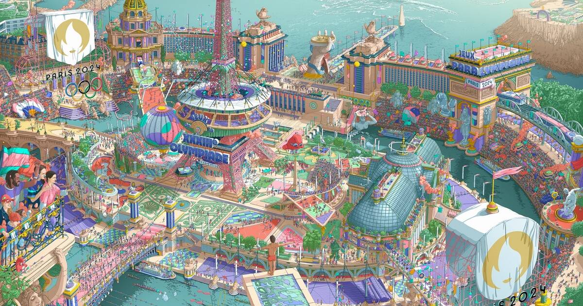
Sign up here to receive our free Libélympique newsletter every Friday. Are you a fan of Miyazaki? Of Claude Ponti, Moebius, Jérôme Bosch, or Martin Handford, the creator of Where’s Waldo books? Proof that the media arts gamble was successful, all these great illustration figures were mentioned by the press on Tuesday, March 5th to decode the posters of the Olympics and Paralympics drawn by Ugo Gattoni and unveiled the day before by the Paris 2024 Olympic Games organizing committee (Cojo). Like everyone else, Libération played along and deciphers nine details that you may have missed. With a valuable guide called Joachim Roncin, the director of design for Paris 2024.
The revamped motto was a heartfelt cry, “Oh, they left a huge spelling mistake in the foreground.” Citius, altius, fortius floating in the turquoise waters of the diving board, we see that’s the motto. But communiter, there’s a problem: it’s either community or to communicate. Yes…but no actually. To be more inclusive, the International Olympic Committee indeed retouched the motto before the Tokyo Olympics. In French, it became “Faster, higher, stronger – Together.” In English, “Faster, higher, stronger – Together.” And in Latin, “Citius, altius, fortius – Communiter.” We should pay more attention during Roman civilization class… “We could have just put a logo but it would have been a simple poster, not a story,” Roncin tells Libé. For him, Gattoni’s mural “will set a precedent” much like the logo of the 1968 Mexico Olympics, which became a benchmark for graphic designers worldwide.
One flammable bottle confesses that we also rubbed our eyes at the top of the Paralympic poster: what on earth was a bottle of Perrier sparkling water (restaurant version) doing swimming in the Mediterranean Sea at the end of a jetty covered in green and violet checkerboard patterns? The answer, easily understandable by Olympics aficionados, is that it’s not a bottle of Perrier. A bit more elaborately, it’s the Olympic torch designed by Mathieu Lehanneur awaiting its flame.
In the name of eco-friendly sobriety, the 2024 torch is made of 100% recycled steel and only 2,000 will be made for the torch relay, compared to 10,000 in previous Olympics. This floating torch is one of Joachim Roncin’s favorite details in the mural because Lehanneur “put a lot of emphasis on symmetry synonymous with equality and parity, and Gattoni drew the reflection of the other half of the torch in the water ripples. Design, illustration, values, everything comes together.”
And where will the flame go, which slumbers in Greece between Olympics, to France on May 8th? Well, the three-masted ship nested at the top left of the Olympic version of the poster, not too far from Armel Le Cléac’h’s trimaran. The Olympic flame will travel from Athens to Marseille by sea aboard the Bélem, a 19th-century ship built to transport cocoa beans between Brazil and France.
Stay tuned for the next part of the article.

